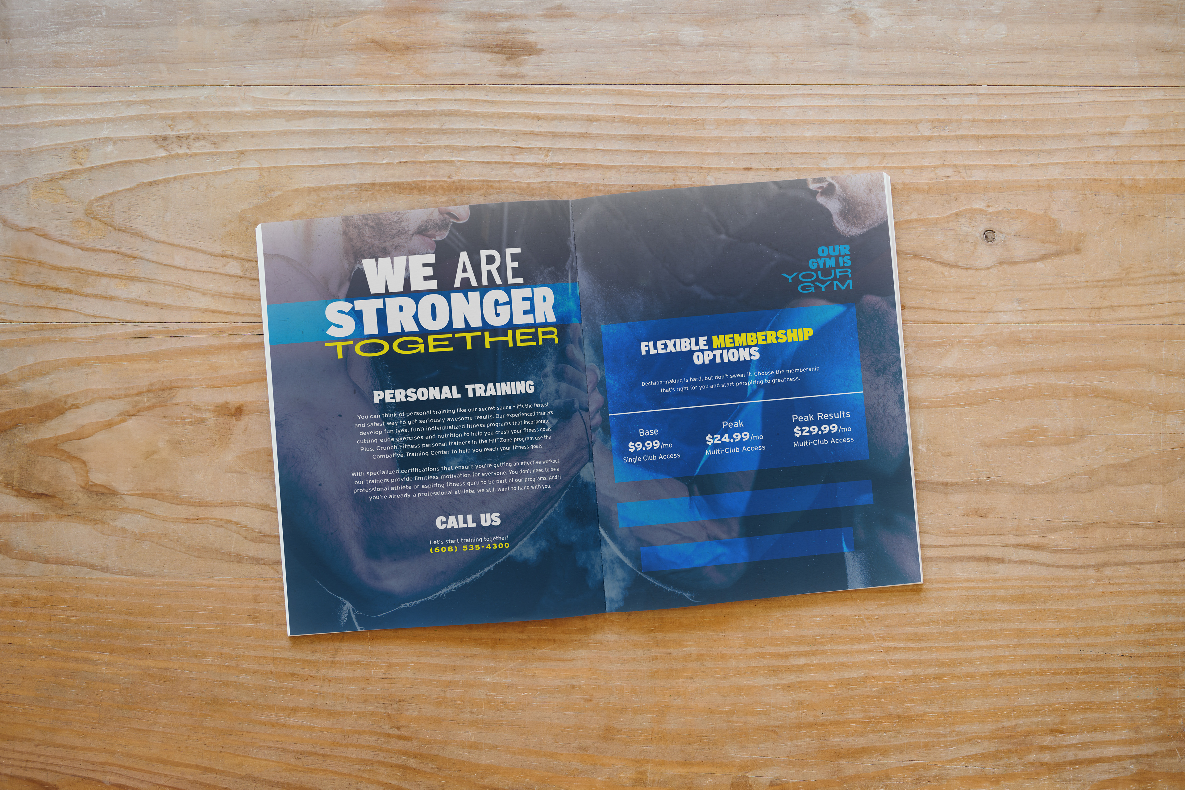
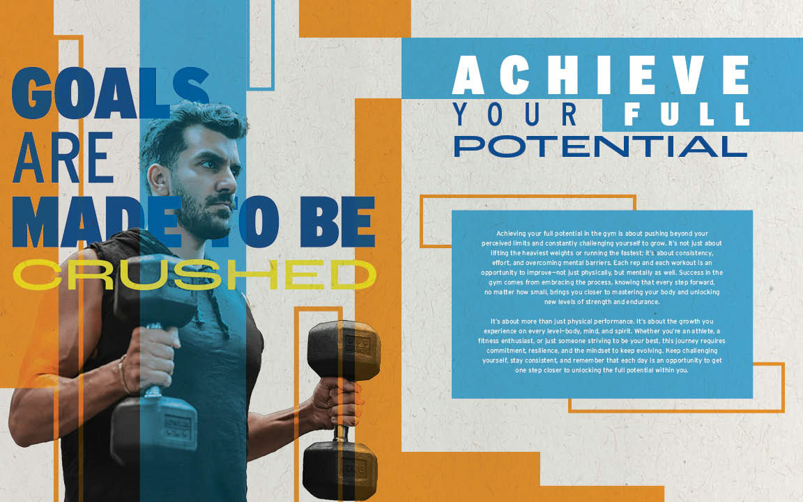
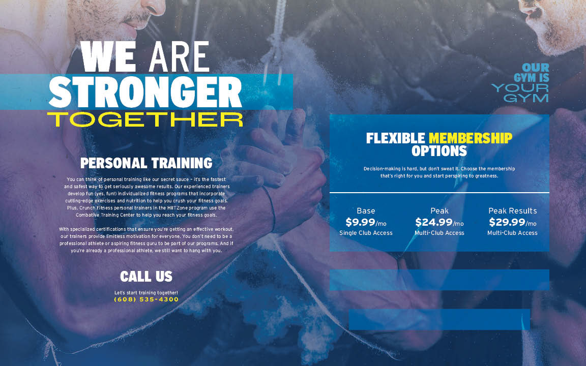
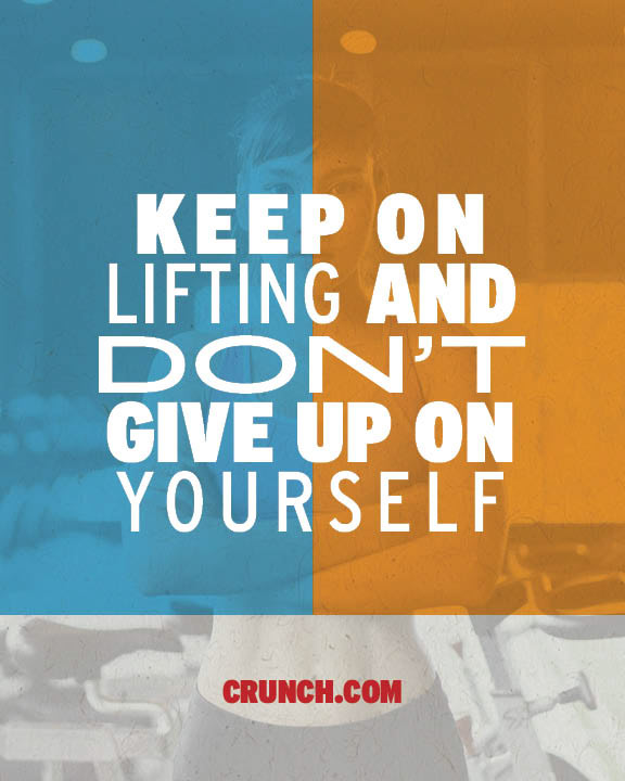
Brochures are very cool to read and look at especially if they're a neat place. Working on this project the goal was to create a brochure for a brand with a unique and unified visual style that communicates a feeling. I decided to go with Crunch Fitness because they're a great gym that use bright colors. I wanted to incorporate those bright colors in the brochure along with unique shapes and image transformations. I decided to use elements and using the same color scheme as Crunch Fitness. I was able to achieve